
How a 365-Day Guarantee Quietly Costs Sales
Brooklinen shows how generous returns, clearance terms, mobile layout, and delivery uncertainty can make shoppers question the promise at the moment of decision.

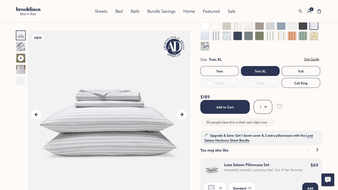
Brooklinen is a well-run, well-loved bedding brand with a strong product and a clean site. That is why it makes a useful teardown: when a store this good still creates trust friction, the pattern is worth studying.
The audit found one main issue. Brooklinen's strongest trust promises sometimes separate from the fees, exceptions, and delivery details shoppers need before they buy.
The teardown in one sentence
Brooklinen's biggest leak was not a broken button. It was a trust promise that does real selling work, then asks the shopper to reconcile fees, exceptions, and missing delivery clarity right when they are deciding whether to buy.
That pattern shows up across hundreds of stores we audit. The surface changes. The failure is the same: the page makes a promise, then the details make the shopper wonder whether the promise really applies to them.
The promise does the selling
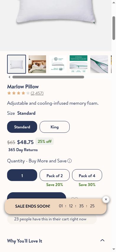
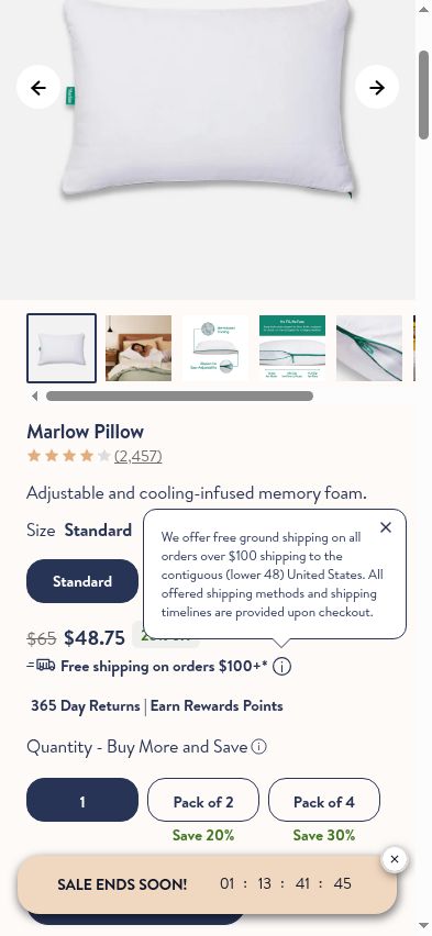
Next to the price sits a confident badge: "365 Day Returns." It reads as a generous, low-risk promise, and it does real work convincing a first-time buyer to try an expensive set of bedding.
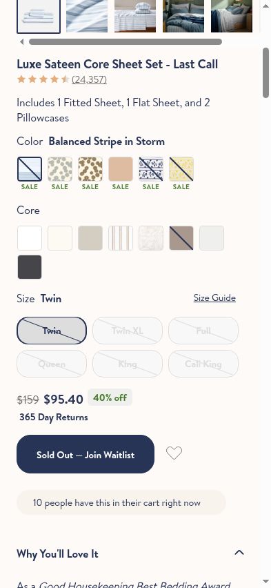
Then our shopper opened the collapsed details. The return comes with a $9.95 fee, disclosed inside an accordion that many shoppers will never expand. On a Last Call clearance item, the same promise appears in a context where the terms are not the everyday promise the badge implies.
The badge earns trust. The hidden condition spends it. A shopper who feels the promise was bigger than the reality does not only question that one policy. They trust the next promise on the page a little less.
Watch the guarantee problem happen
The fix is not to remove the promise. The fix is to make the promise and the conditions travel together. If there is a fee, say it near the badge. If the item is clearance, make the exception visible at the same decision point.
The decision starts below the fold
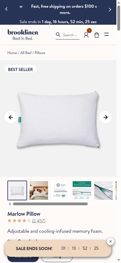
On mobile, the product image pushes the buy box, price, and size selector below the fold. So the first screen does not answer the shopper's two most basic questions: what does it cost, and what can I choose?
That is a small layout choice with a real cost. Analytics may show a product-page drop-off, but it will not tell you that the shopper had to scroll before the page became a buying page.
The page asks shoppers to reconcile too much
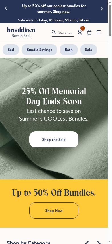
During a sale, our shoppers saw three discount messages competing on one screen: an announcement bar, a hero banner, and a promo band below it. The numbers did not agree. The intent is to make the offer feel big. The effect is that the shopper has to calculate which promise applies to them.
Delivery timing adds the same kind of uncertainty. The shipping tooltip says timelines are provided at checkout, which means the shopper cannot answer a basic planning question until the end of the flow.
These are not dramatic UX failures. They are small moments where the shopper has to pause, interpret, and decide whether the page really means what it says.
What Brooklinen could test
- Put the return fee next to the 365-day promise, not only inside collapsed detail copy.
- Change the return badge or supporting copy on Last Call items so the promise matches the item context.
- Move price, size selection, and the primary buy action higher on mobile product pages.
- Consolidate sale messaging so one offer hierarchy wins instead of making the shopper compare three numbers.
- Show estimated delivery timing before checkout, even if it is a range.
The lesson for every store
None of this is exotic. These are ordinary leaks that accumulate on good stores. The through-line is simple: your trust signals have to be true, clear, and consistent at the moment of decision, or they work against you.
So here is the exercise. Look at your own store the way a first-time shopper would. Find every trust badge, guarantee, and promo claim near your price and add to cart. Then check each one against its own fine print and against the item it sits on. Do they agree? Would a shopper who believed the badge feel the reality matched it?
A promise that overdelivers builds a brand. A promise that underdelivers in the fine print does the opposite, and it does it at the most expensive moment you have.
That is what our AI shoppers are built to catch: not just the broken button, but the quiet contradiction that makes a real person hesitate. Findings here reflect what we observed during our audit. Live sites change over time, so treat this as a study of a pattern, not a scorecard.

See what deserves your attention first
Start with a free scan and get a revenue-ranked view of the conversion opportunities worth investigating.
Free baseline audit · No credit card · Optional free-trial follow-up