
Keep the Next Step Beside the Decision
BÉIS shows how app-only buying, separated policy details, and buried product proof can create extra work at the moment a shopper is ready to decide.

BÉIS has a distinctive visual brand, polished product photography, and a large base of visible customer reviews. That makes it a useful teardown: the store already creates desire, but several captured journeys placed the next step, policy condition, or strongest product proof away from the moment when a shopper needed it.
This is an independent study of one audit snapshot. It is not a claim about BÉIS's internal analytics or business performance.
The teardown in one sentence
BÉIS's clearest decision leak was separation: the store often had the right answer, but not beside the decision that answer was meant to support.
App-only early access needs a complete handoff
App-only early access is not inherently a problem. The handoff matters.
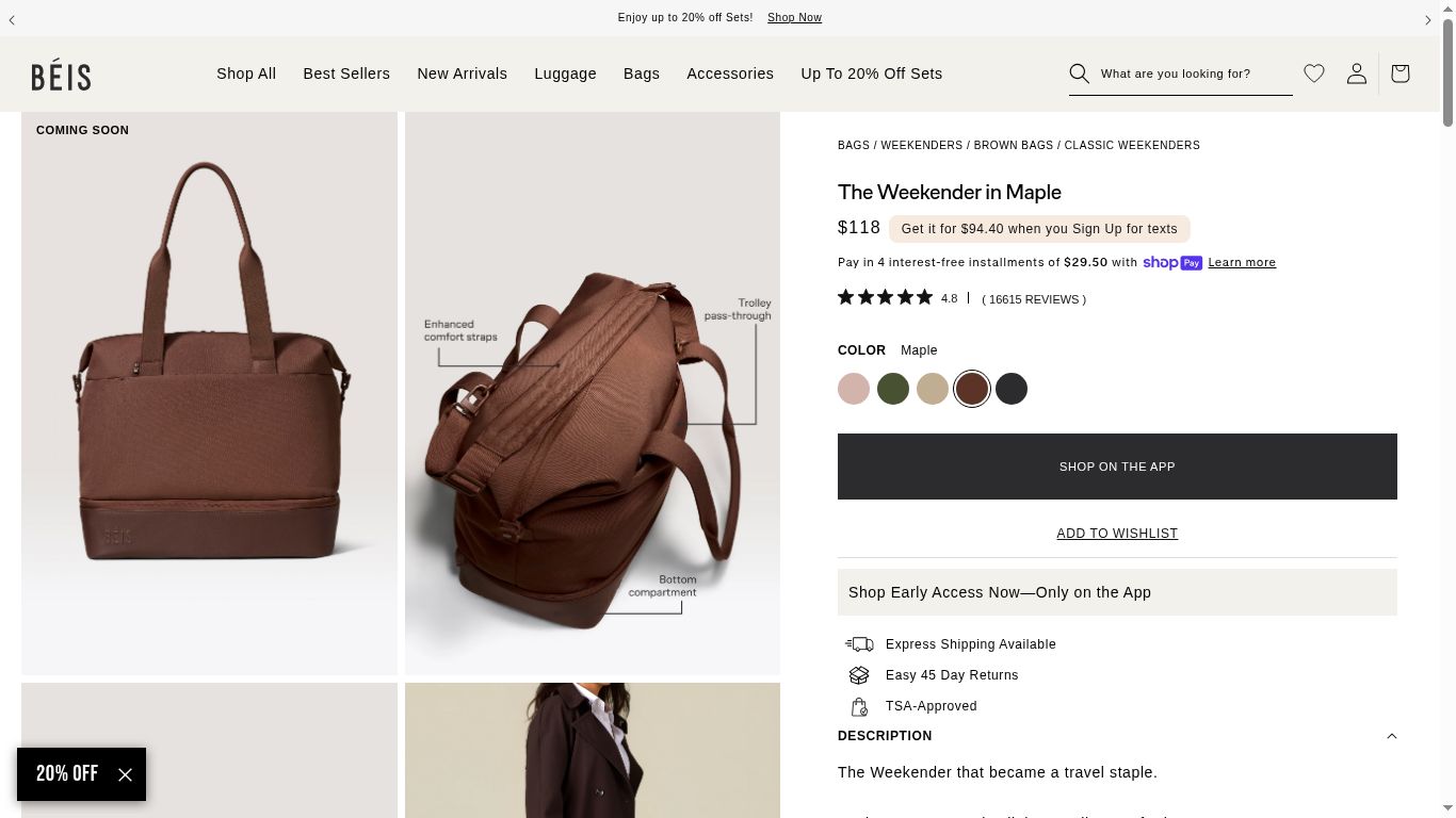
On the captured Weekender page, the product was priced at $118 and surrounded by color choices, reviews, and detailed product imagery. The purchase action read “SHOP ON THE APP,” followed by “Shop Early Access Now—Only on the App.”
The visible decision area did not include a QR code, app-store link, or SMS handoff. The page communicated where the shopper had to go without helping them get there.
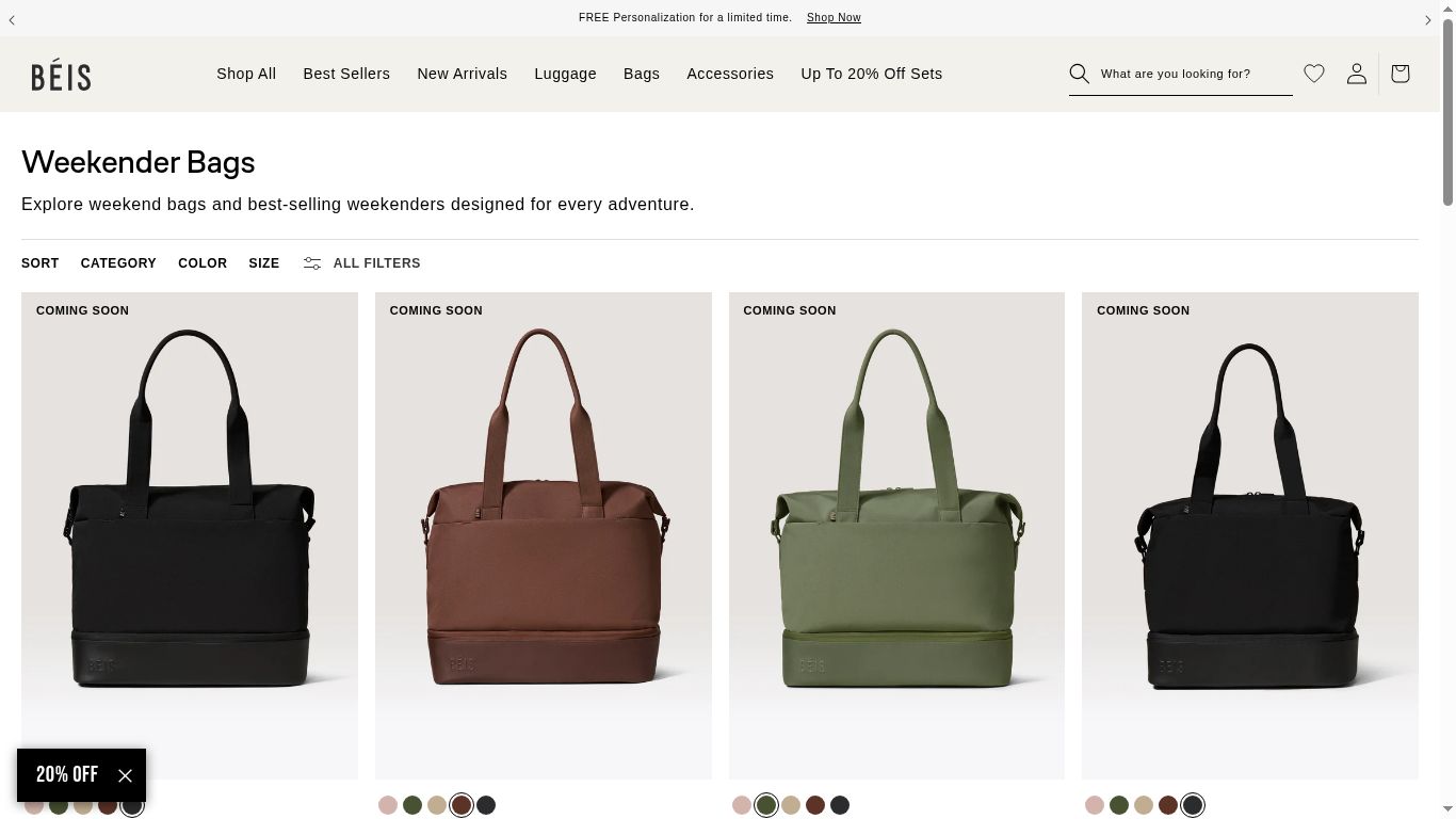
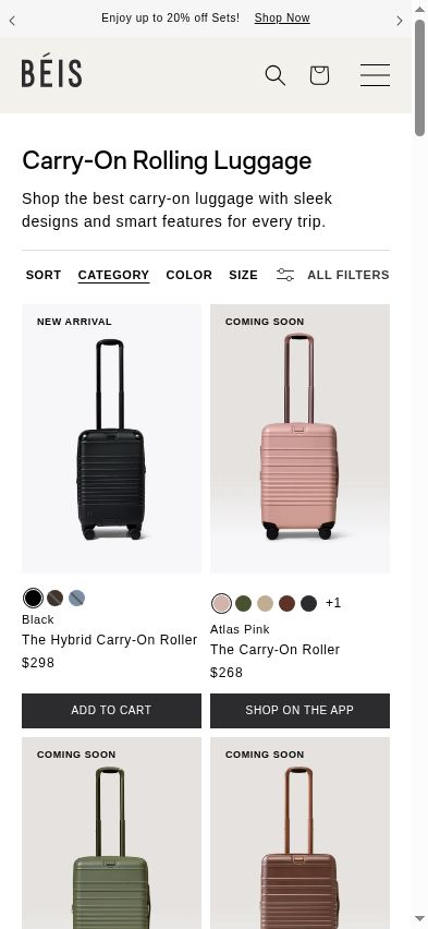
The same pattern appeared one level earlier. The Weekender collection opened with a row of products labeled “COMING SOON.” On the Carry-On collection, one visible product offered “ADD TO CART” while the neighboring product offered “SHOP ON THE APP.”
That mixed state asks shoppers to decode availability product by product. BÉIS could test leading with web-purchasable products, then grouping early-access items in a clearly labeled section with a direct app handoff.
There is a real trade-off. If the launch is intended to grow app adoption, making web-purchasable products more prominent could reduce app referral clicks. The test should therefore measure both sides: collection add-to-cart and conversion rates alongside app referrals. For the product-page bridge, BÉIS could track app installs from web and revenue per session instead of treating the app gate itself as the problem.
Trust badges make a promise before the policy adds context
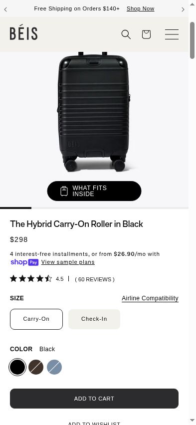
The $298 Hybrid Carry-On page placed “Easy 45 Day Returns” and “Limited Lifetime Warranty” directly below the buying controls. Both are strong reassurance signals. The details required more research.
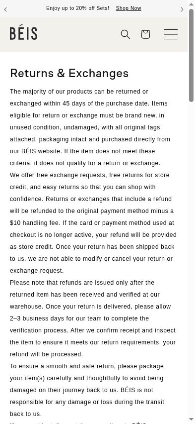
The separate returns page said that refunds to the original payment method are reduced by a $10 handling fee. The fee may be reasonable; the friction comes from making the shopper leave the product page to discover the qualification behind “Easy.”
More precise badge copy could make some shoppers pause. That is why this should be tested rather than treated as an automatic win: compare add-to-cart and checkout completion against return behavior while keeping the 45-day window and the $10 card-refund condition together.
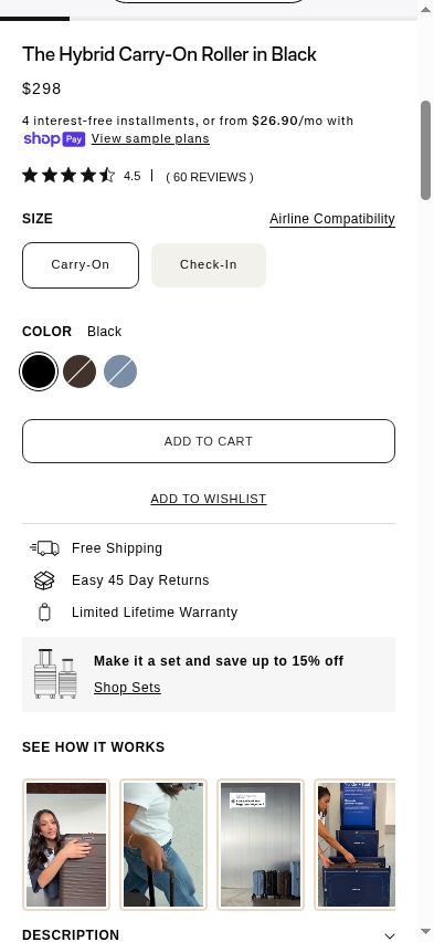
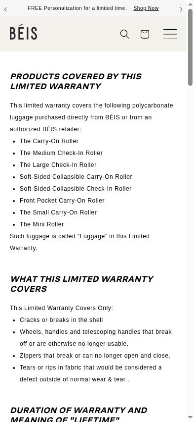
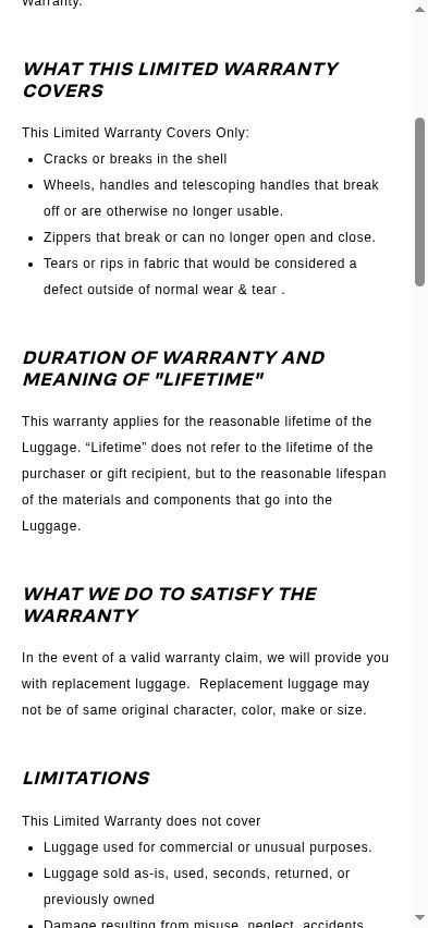
The warranty journey created a different reconciliation task. The Hybrid product page showed the lifetime-warranty badge, while the captured warranty page listed eight covered roller products without naming the Hybrid Carry-On Roller. The same policy defined “lifetime” as the reasonable lifespan of the luggage rather than the lifetime of the purchaser.
The practical fix is precision. If the Hybrid is covered, name it on the policy page. If coverage differs, change the product-page badge, even if that makes the offer feel less generous. Either way, keep the reassurance and its scope together.
Premium proof exists, but some of it arrives late
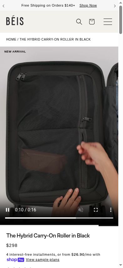
The Hybrid Carry-On page had useful product evidence. In the captured flow, exterior imagery led the gallery while an interior packing demonstration appeared in a lower-page video. A shopper comparing capacity had to move beyond the main gallery to see how the inside worked.
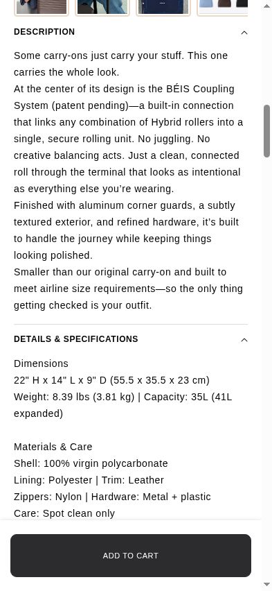
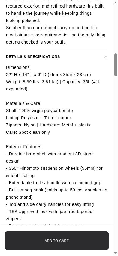
The specification hierarchy repeated the issue in text. “Hardware: Metal + plastic” appeared in Materials & Care. Farther down, Exterior Features named “360° Hinomoto suspension wheels (55mm),” a much more specific quality signal.
BÉIS could test bringing that named component into the higher-visibility hardware line. The goal is not more copy. It is putting the strongest proof where a quality-focused shopper is already looking.
The gallery has a design trade-off too: BÉIS's minimal photography supports the brand's polished aesthetic, while packed-interior and lifestyle images add visual density. A carefully art-directed interior still can preserve that aesthetic while answering the capacity question earlier.
What BÉIS could test
- Add a desktop QR code and mobile app-store links beside every “SHOP ON THE APP” action, then measure app installs from web and revenue per session.
- Lead collection pages with products that can be purchased on the web, then group app-only or coming-soon products under a clear label while monitoring app referral clicks.
- Change the returns badge to state the 45-day window and the $10 original-payment refund fee together, then compare add-to-cart, checkout completion, and return behavior.
- Align the Hybrid warranty badge with the covered-product list so the product page and policy answer the same question.
- Add a polished packed-interior still to the main Hybrid gallery instead of requiring a shopper to find and play a lower-page video.
- Replace the generic hardware line with the already-published Hinomoto wheel specification, applied consistently wherever the shared product template uses the same component.
The lesson for every store
A shopper should not have to translate “buy this in the app” into a download journey, translate “easy returns” into a separate fee policy, or translate “metal + plastic” into the named component that proves quality.
The evidence and the offer already exist on BÉIS. The goal is to make each next step, condition, and proof point travel with the decision it is meant to support. Then measure the business goal that each change could put at risk.
Findings here reflect what we observed during the July 16, 2026 audit. Live sites change over time, so treat this as a study of a pattern, not a verdict.

See what deserves your attention first
Start with a free scan and get a revenue-ranked view of the conversion opportunities worth investigating.
Free baseline audit · No credit card · Optional free-trial follow-up